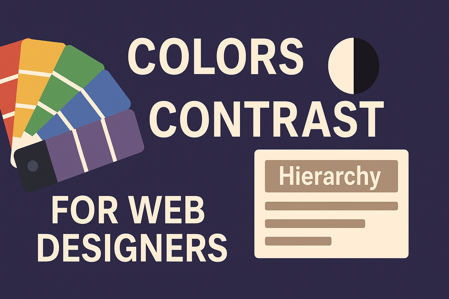
Colors, Contrast & Visual Hierarchy for Web Designers
Introduction
Color is a powerful tool in UI. Paired with contrast and layout hierarchy, it can steer the user’s eye, highlight importance, and ensure accessible readability. But misuse of color — poor contrast, chaotic palettes — can confuse users or exclude those with visual impairments.
In this post, you’ll learn:
Basic color theory: how colors relate
Contrast: why it matters and how to measure it
Visual hierarchy: combining size, color, layout to guide focus
Accessibility with color: ensuring everyone can perceive your UI
Practical CSS & design examples
By the end, you’ll be able to design interfaces that are beautiful, usable, and inclusive.
1. Basic Color Theory for Web Design
Before applying colors, understand how they work together.
1.1 Color Wheel, Relationships & Schemes
Hue, Saturation, Lightness (HSL) — a helpful model for adjusting colors
Complementary (opposite on the wheel): high contrast
Analogous (next to each other): harmonious, softer transitions
Triadic / Tetradic: balanced contrast with multiple points
Using color schemes helps maintain consistency and visual cohesion.
1.2 Tints, Shades & Tones
Tint: adding white → lighter version
Shade: adding black → darker version
Tone: adding gray → muted version
These variants help you build a palette of primary, secondary, and accent colors.
Using contrast between tones is often more subtle and readable than pure hue contrast.
1.3 Color Psychology & Branding
Colors evoke emotions:
Red → urgency, energy, action
Blue → trust, calm, stability
Green → growth, health, success
Yellow/orange → warmth, attention
Use accents in your palette to guide users — e.g. buttons, links — but sparingly so your UI doesn’t feel chaotic.
2. Contrast: Why It Matters, How to Measure
Contrast is what makes text legible, buttons pop, and hierarchy understandable.
2.1 Contrast in Visual Hierarchy
Color contrast helps prioritize elements. Strong contrasting elements (by color or tonal difference) draw attention.
For example, a call-to-action button in a bright accent color against a muted background will stand out.
2.2 Accessible Contrast Ratios (WCAG)
Web Content Accessibility Guidelines define safe contrast levels:
At least 4.5:1 for normal text
At least 3:1 for large text (e.g. ≥ 18 pt bold or ≥ 24 pt)
You can use tools like Contrast Checker to test color combinations.
Ensure text, icons, UI elements meet these minimum ratios.
2.3 Common Pitfalls and How to Avoid
Light text on light backgrounds, or dark text on dark backgrounds
Too many accent colors competing for attention
Relying on color alone to convey meaning (use icons/underlines)
Ignoring color-blind users — use simulation tools or high-contrast modes
3. Visual Hierarchy: Guiding the User’s Eye
Visual hierarchy arranges elements so users intuitively know what to look at first, second, third.
3.1 Core Principles
Size / Scale — larger elements feel more important
Color / Contrast — stronger contrast helps highlight focus areas
Spacing / Proximity — related items should cluster; unrelated ones should separate
Alignment / Layout — consistent grids help the eye flow naturally
Repetition & Consistency — repeating style cues reinforces hierarchy and familiarity
Visual hierarchy is also guided by how the human eye scans (e.g. “F” pattern in text-heavy layouts) .
3.2 Building a Hierarchy in Practice
Suppose you have a hero section:
<h1>with large font size, bold weight, dark colorSubheading
<h2>smaller, lighter colorButton with accent color
Peripheral imagery with lower contrast
These layering choices lead users: Title → Subheading → CTA → supportive graphics.
Hierarchy levels: primary, secondary, tertiary. Too many layers cause noise.
4. Applying CSS: Examples & Techniques
Let’s build a small UI component with color, contrast, and hierarchy.
HTML
<section class="hero">
  <h1>Welcome to My Site</h1>
  <p>Crafting delightful UI through thoughtful design.</p>
  <a href="#" class="btn primary">Get Started</a>
</section>
CSS
:root {
  /* Base colors */
  --color-bg: #ffffff;
  --color-text: #222222;
  --color-muted: #666666;
  --color-accent: #0077ff;
  /* For buttons */
  --color-accent-light: #3399ff;
}

body {
  background: var(--color-bg);
  color: var(--color-text);
  font-family: sans-serif;
  margin: 0;
  padding: 0;
}

.hero {
  text-align: center;
  padding: 4rem 1rem;
}

.hero h1 {
  font-size: 2.5rem;
  color: var(--color-text);
  margin-bottom: 0.5em;
}

.hero p {
  font-size: 1.2rem;
  color: var(--color-muted);
  margin-bottom: 1.5em;
}

.btn.primary {
  background-color: var(--color-accent);
  color: #fff;
  padding: 0.75rem 1.5rem;
  text-decoration: none;
  border-radius: 4px;
  font-size: 1rem;
  transition: background-color 0.3s ease;
}

.btn.primary:hover {
  background-color: var(--color-accent-light);
}Hierarchy:
h1is the most visually dominant, then paragraph, then button.Contrast: Text vs background has strong contrast. CTA button in accent color stands apart.
Spacing: Vertical margins separate elements to avoid clutter.
You can expand this pattern to navigation bars, cards, footers, and modular components.
5. Accessibility & Color-Blind Considerations
Design for all users, including those with color vision deficiencies.
Use tools to simulate color-blind modes
Avoid relying purely on color — add underlines, icons, or bold text
Stick to high contrast color palettes
Use semantic HTML (e.g.,
<button>,<label>) so assistive tech can interpret UI
Research shows interfaces that ignore color-blind users can severely degrade usability.
✅ Summary & What’s Next
You’ve now:
Learned core color theory and how to build palettes
Understood contrast, how to test it, and why it’s essential
Grasped visual hierarchy principles and how they guide the eye
Seen CSS examples to build hierarchy with color, scale, spacing
Covered accessibility considerations for inclusive UI
In the next post, we’ll shift to Phase 1’s last lesson: “Practical Project: Building a Simple Frontend Design Mockup”, where you put everything you’ve learned (HTML, box model, typography, color, hierarchy) into a real design you code from scratch.
Related
Design Systems & Component Libraries — TailwindCSS, CSS-in-JS & Scalable Frontend Architecture
Learn how to build scalable design systems and UI component libraries using TailwindCSS, CSS variables, and CSS-in-JS. Create reusable, consistent, and maintainable frontend foundations.
Performance Optimization for CSS & Frontend Rendering
Learn advanced CSS and frontend optimization techniques to enhance performance, improve rendering speed, and ensure smooth, fast user experiences.
Animations, Transitions & Microinteractions for Delightful UX
Learn how to use CSS animations, transitions, and microinteractions to create interactive, engaging, and intuitive frontend experiences that captivate users.
Comments