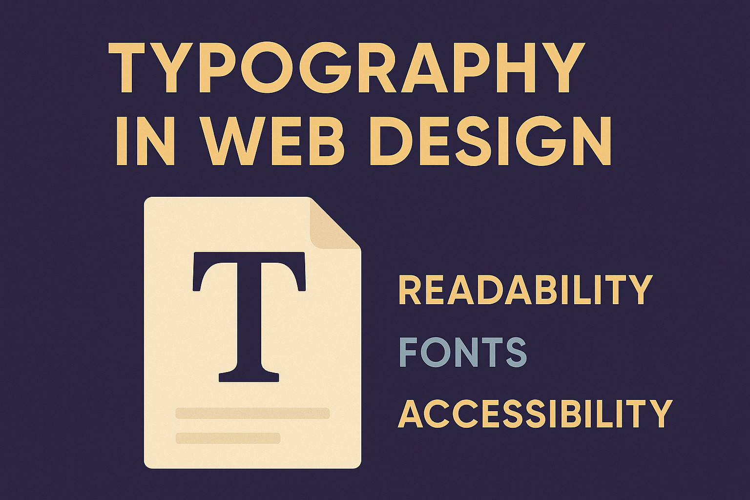
Typography in Web Design: Fonts, Readability & Accessibility
Introduction
Typography is more than just picking pretty fonts.
It’s the art and science of arranging text so it’s clear, readable, and meaningful.
In web design, good typography defines hierarchy, guides user attention, and enhances user experience.
In this post, we’ll cover:
Principles of good typography for the web
Font types, pairings, and performance
Line height, spacing, and typographic hierarchy
Accessible contrast and font sizing
Practical CSS examples for implementing beautiful, legible type
By the end, you’ll know how to make your text feel right — balanced, readable, and consistent across devices.
1. Understanding Typography on the Web
Typography defines how content feels. Users rarely notice great typography — but poor typography instantly hurts usability.
1.1 The Key Elements of Web Typography
Font family — The typeface(s) you use (e.g., Roboto, Inter, Georgia).
Font weight — Thickness (e.g.,
400,700).Font size — Controlled via
rem,em, or responsive units.Line height — Vertical space between lines.
Letter spacing (
letter-spacing) — Space between characters.Word spacing (
word-spacing) — Space between words.
Typography affects reading speed, comprehension, and retention.
Research shows a well-chosen type hierarchy increases readability by up to 20–30 %.
2. Choosing Fonts for Web Design
2.1 Web-Safe vs. Web Fonts
Web-safe fonts (Arial, Verdana, Times, Georgia, etc.) are universally supported and load instantly.
Web fonts (Google Fonts, Adobe Fonts) allow creative expression but add network requests.
Use the font-display: swap property in CSS to ensure quick fallback while web fonts load:
@font-face {
  font-family: "Inter";
  src: url("Inter.woff2") format("woff2");
  font-display: swap;
}
2.2 Font Pairing Basics
Use two complementary fonts:
One for headings (display serif or sans-serif)
One for body text (neutral sans-serif)
Example pairs:
Heading | Body | Feel |
|---|---|---|
Playfair Display | Lato | Elegant & editorial |
Montserrat | Open Sans | Clean & modern |
Poppins | Roboto | Friendly & geometric |
Rule of thumb — limit to 2 typefaces per site.
3. Readability: Size, Line Height & Spacing
3.1 Font Size
Base your text on the user’s root font size (usually 16 px = 1 rem).
body {
  font-size: 1rem;   /* 16px */
}

h1 { font-size: 2.5rem; }
h2 { font-size: 2rem; }
h3 { font-size: 1.5rem; }
p  { font-size: 1rem; }
Responsive typography can use clamp() for fluid scaling:
h1 {
  font-size: clamp(1.8rem, 2vw + 1rem, 3rem);
}
3.2 Line Height
Line height (line-height) affects readability dramatically.
Ideal range: 1.4 – 1.8 for body text
Headlines can be tighter: 1.1 – 1.3
p {
  line-height: 1.6;
}
3.3 Letter & Word Spacing
Slightly increase letter spacing for uppercase text.
Avoid excessive letter spacing in body copy — it reduces legibility.
4. Establishing Typographic Hierarchy
Visual hierarchy helps readers scan and understand your content structure.
Use differences in:
Font size
Weight
Color/contrast
Spacing (margin/padding)
Capitalization
Example:
<article class="post">
  <h1>Typography in Web Design</h1>
  <h2>Readability and Accessibility</h2>
  <p>Typography is about communication, not decoration.</p>
</article>
h1 {
font-size: 2.5rem;
font-weight: 700;
margin-bottom: 0.5em;
}
h2 {
font-size: 1.5rem;
color: #555;
margin-bottom: 1em;
}A clear hierarchy helps screen readers too — they use heading levels to navigate content.
5. Accessibility & Color Contrast
Typography and accessibility go hand in hand.
5.1 Contrast Ratio
Text should have at least:
4.5:1 contrast for normal text
3:1 for large text (above 18 px bold or 24 px normal)
Use contrast-checker tools to verify compliance with WCAG 2.1.
body {
  color: #222;
  background-color: #fff;
}
5.2 Don’t Use Only Color to Convey Meaning
Always pair color with another indicator (icon, underline, bold text).
5.3 Font Size & Accessibility
Let users resize text easily:
Use
remunits instead ofpx.Avoid fixed heights on text containers.
6. Performance & Best Practices
Load only needed font weights (e.g., 400 and 700).
Use variable fonts where possible — fewer requests, smoother scaling.
Always define fallback fonts:
font-family: "Inter", "Helvetica Neue", Arial, sans-serif;Test readability on mobile: text should be legible without zooming.
Ensure sufficient spacing between lines and paragraphs for touch interactions.
7. Example: A Simple Typographic System
HTML
<main class="typography-demo">
  <h1>Welcome to My Blog</h1>
  <h2>Design That Communicates</h2>
  <p>Typography is the backbone of visual communication. The right font choice enhances usability and style.</p>
  <a href="#">Read More →</a>
</main>
CSS
:root {
  --font-base: "Inter", Arial, sans-serif;
  --font-heading: "Poppins", sans-serif;
  --color-text: #222;
  --color-bg: #fff;
  --color-link: #0077ff;
}

body {
  font-family: var(--font-base);
  line-height: 1.7;
  background: var(--color-bg);
  color: var(--color-text);
  padding: 2rem;
}

h1, h2 {
  font-family: var(--font-heading);
  margin-bottom: 0.6em;
}

h1 {
  font-size: clamp(2rem, 4vw + 1rem, 3rem);
  line-height: 1.2;
}

h2 {
  font-size: 1.5rem;
  color: #555;
}

p {
  font-size: 1rem;
  margin-bottom: 1.5em;
}

a {
  color: var(--color-link);
  text-decoration: none;
}

a:hover {
  text-decoration: underline;
}
This system uses CSS variables for consistency, scalable units for responsiveness, and accessible contrast ratios.
✅ Summary & What’s Next
You’ve just learned:
How typography shapes readability and UX
Principles of font pairing and sizing
Techniques for line height and spacing
How to make text accessible and performant
Practical CSS for consistent, beautiful type
In the next post, you’ll move into color, contrast, and visual hierarchy — learning how to create visually appealing, balanced designs using color theory and layout principles.
👉 Continue to “Colors, Contrast & Visual Hierarchy for Web Designers”.
Related
Design Systems & Component Libraries — TailwindCSS, CSS-in-JS & Scalable Frontend Architecture
Learn how to build scalable design systems and UI component libraries using TailwindCSS, CSS variables, and CSS-in-JS. Create reusable, consistent, and maintainable frontend foundations.
Performance Optimization for CSS & Frontend Rendering
Learn advanced CSS and frontend optimization techniques to enhance performance, improve rendering speed, and ensure smooth, fast user experiences.
Animations, Transitions & Microinteractions for Delightful UX
Learn how to use CSS animations, transitions, and microinteractions to create interactive, engaging, and intuitive frontend experiences that captivate users.
Comments