Master the Visual Box Model: Margins, Padding & Borders Explained
Introduction
In your journey through frontend design, the CSS box model is one of the most fundamental concepts you must master. Every visible element is rendered as a box — composed of content, padding, border, and margin.
A misunderstanding of how these layers interact is often the cause of layout bugs, spacing errors, or “mystery gaps” in your design. In this post, you’ll get a deep, visual, and practical understanding of:
The different layers: content, padding, border, margin
How to compute the total size of an element
The
box-sizingproperty and how it changes layout behaviorMargin collapsing (and how to manage it)
CSS shorthand for margin, padding, border
Practical examples and debugging tips
By the end, you will control spacing confidently and avoid common layout surprises.
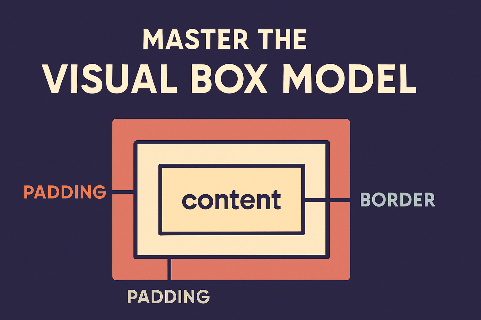
1. Anatomy of the Box Model
Every HTML element is a rectangular box. It has up to four layers:
margin → border → padding → contentContent: Where text, images, or child elements are placed.
Padding: Space inside the border, between border and content.
Border: The visible line (solid, dashed, etc.) around the padding & content.
Margin: Space outside the border, pushing other boxes away.
Visual browsers/dev tools usually highlight these layers in different colors — making it much easier to see. The CSS box model specification describes how margin, padding, border, width, and height combine to define an element’s rendered size.
Example (with numbers)
.box {
  width: 200px;
  height: 100px;
  padding: 10px;
  border: 5px solid #333;
  margin: 20px;
}
Let’s break down the total rendered size:
Content area = 200px × 100px
Padding: 10px on all sides → adds 20px horizontally + 20px vertically
Border: 5px on all sides → adds 10px horizontally + 10px vertically
Margin: 20px on all sides → extra space outside (not counted in width/height)
So:
Total width = 200 + 20 (padding) + 10 (border) = 230px
Total height = 100 + 20 (padding) + 10 (border) = 130px
Margin does not count inside that size; it creates space around the box.
2. The Role of box-sizing
By default, CSS uses the “content-box” model: width/height refer only to the content box, and padding + border are added outside it.
But many modern web projects prefer:
*,
*::before,
*::after {
  box-sizing: border-box;
}
With box-sizing: border-box, the width and height include padding and border. This is easier to reason about, especially when doing responsive layouts.
Example with border-box:
.box2 {
  box-sizing: border-box;
  width: 200px;
  border: 5px solid black;
  padding: 10px;
}
Here, the content + padding + border all must fit into 200px. So content width is automatically reduced to accommodate padding and border.
border-box is widely used (frameworks like Bootstrap apply it globally) because it avoids the surprise of elements “growing” when padding or borders are added.
3. Margin Collapsing & Edge Cases
One tricky aspect: margin collapsing. In some cases, adjacent vertical margins between block-level elements collapse (i.e., they don’t add up).
When does margin collapse happen?
Between a parent and its first/last child (when no border/padding intervenes)
Between adjacent sibling block elements
Example:
<div class="parent">
  <p class="child">Hello</p>
</div>
If .parent and .child both have margin-top: 20px, you might expect 40px of space, but margin collapse often results in only 20px of combined margin.
To avoid collapse, you can:
Add padding or border to the container
Use
overflow: auto(or other overflow values)Insert an element (like a borderless wrapper)
Margin collapsing can be confusing; testing and inspecting in dev tools helps.
4. CSS Shorthand and Logical Properties
Instead of writing four separate margin or padding declarations, CSS supports shorthand:
/* margin: top right bottom left */
margin: 10px 20px 10px 20px;

/* or simplified */
margin: 10px 20px;            /* top & bottom 10px, left & right 20px */
margin: 10px;                 /* all sides 10px */
margin: 10px 20px 30px;       /* top 10, sides 20, bottom 30 */
Same shorthand works for padding.
You can also style borders succinctly:
border: 2px dashed #555;Modern CSS supports logical properties (like margin-block-start, padding-inline-end) which adapt to writing direction (LTR, RTL) and layout flow.
5. Practical Examples & Layout Control
Let’s build a layout using correct spacing.
HTML
<div class="card">
  <h2>Card Title</h2>
  <p>This is a card. It has some content and padding around it.</p>
</div>
CSS (using border-box)
*,
*::before,
*::after {
  box-sizing: border-box;
}

/* base styles */
body {
  font-family: sans-serif;
  padding: 2rem;
  background: #f5f5f5;
}

.card {
  max-width: 400px;
  margin: 1rem auto;       /* center horizontally with auto left/right */
  padding: 1.5rem;          /* inner spacing */
  border: 1px solid #ddd;
  background: white;
  border-radius: 8px;
  box-shadow: 0 2px 5px rgba(0,0,0,0.1);
}

.card h2 {
  margin-bottom: 1rem;      /* separate heading from paragraph */
}

.card p {
  margin-bottom: 0;        /* remove bottom margin for last child */
}
Inspecting via dev tools, you’ll see exactly how content, padding, border, margin stack up.
You can expand this to layout multiple cards side by side, using display: flex or grid (we’ll dive into layout modules later).
6. Debugging Spacing & Common Issues
Here are tips when things go wrong:
Use browser dev tools’ box model view — it shows padding, border, margin in color-coded regions
Start with
box-sizing: border-boxglobally — many layout bugs vanishWatch for unintended margins (e.g. default on
<p>,<h1>,<ul>)Be careful with margin collapsing at edges
When combining
width+padding+border, double-check resulting sizeDon’t over-nest divs — simpler structure makes spacing easier to manage
✅ Summary & What’s Next
You now have a solid mastery over:
The four layers: content, padding, border, margin
How to compute the true rendered size
The importance and behavior of
box-sizing: border-boxCollapsing of margins and how to prevent it
Using shorthand and logical properties
Debugging spacing errors
In the next post, you’ll dive into typography in web design — fonts, line heights, readability, color contrast, and how good typography elevates your UI.
Stay tuned for “Typography in Web Design: Fonts, Readability & Accessibility”.
Related
Design Systems & Component Libraries — TailwindCSS, CSS-in-JS & Scalable Frontend Architecture
Learn how to build scalable design systems and UI component libraries using TailwindCSS, CSS variables, and CSS-in-JS. Create reusable, consistent, and maintainable frontend foundations.
Performance Optimization for CSS & Frontend Rendering
Learn advanced CSS and frontend optimization techniques to enhance performance, improve rendering speed, and ensure smooth, fast user experiences.
Animations, Transitions & Microinteractions for Delightful UX
Learn how to use CSS animations, transitions, and microinteractions to create interactive, engaging, and intuitive frontend experiences that captivate users.
Comments